Assignment 4 -Jewelina
1. Loading and Understanding the Data
1.b What information is being captured by Perusall in this dataset?
The Perusall dataset captures detailed interactions of students with course materials, including comments, responses, and highlighted texts. It includes identifiers for comments and documents, personal identifiers for students (such as names and IDs), and engagement metrics like word count, upvotes, and replies. This information allows for the analysis of student engagement, the effectiveness of materials, and peer interaction within the educational platform
2. Examining the Data Distribution
2.a
Word Count
Histogram Analysis: The word count distribution shows a significant skew towards shorter comments, with most comments containing between 1 to 45 words. The frequency decreases as the word count increases, indicating that longer comments are less common.
Type-comment and questions
Comments per Paper
The bar chart shows that the paper titled "Introduction to Learning Analytics" receives the most comments, followed closely by "Introduction to Information Visualization, Chapter 1, Introduction". Other papers like "Herodotou et al., 2019" and "Grünspan, 2014" also have a significant number of comments but less than the top two.
Page number distribution
From the bar chart provided for "Page Number,"the pages within the range of 1 to 6.40 have the highest number of comments, peaking sharply at pages close to 1. There is a noticeable decline in the number of comments as the page numbers increase. Pages numbered 6.40 to 11.80 still have a moderate amount of comments but significantly less than the earliest pages.
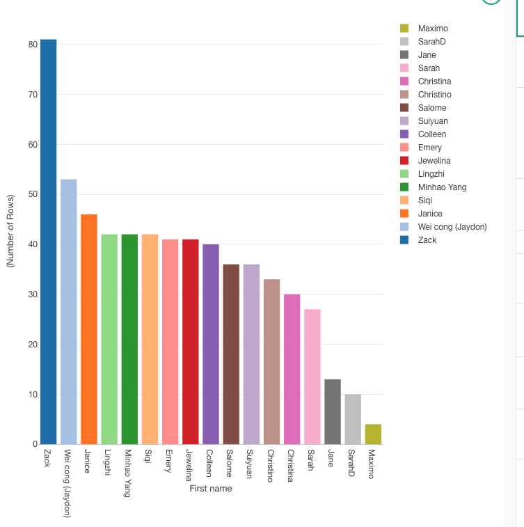
Top 10 Commentators
The bar chart identifies "Maximo Perez" as the most prolific commentator, with a substantial lead over the others. Following Maximo, "SarahD_NA" and "Jane_Li" are also very active, with Sarah having slightly more comments than Jane
i. Are there missing data?
The histograms provided do not directly show missing data. however. i found missing values in specific columns such as "Last Name" and "In Response to Comment ID."
ii. Are there more comments or questions?
From the 'Comment vs. Question' bar plot, we can see the distribution of comment is more frequent.
iii. Which papers receive more comments?
The "Introduction to Learning Analytics" and "Introduction to Information Visualization, Chapter 1, Introduction" receive the most comments, indicating high engagement or possibly contentious topics in these papers.
iv. In which pages most of the comments happen?
Most comments occur on the first few pages, specifically from pages 1 to 6.40, indicating that students are most engaged or have more queries and discussions at the beginning of the documents.
v. Who were the most prolific commentators?
"Maximo Perez" is the most prolific commentator, followed by "SarahD_NA" and "Jane_Li".
3.Tokenizing the Text
i. What new columns are added to the dataset?
"Tokenized Text": This column appears to be the new column added to the dataset, which contains each word from the "Submission" column broken down into separate tokens (words).
ii. The structure of the data is wide or it is long?
Long Structure: The data structure has transformed into a long format because each word from the original "Submission" is now placed in its own row under the "Tokenized Text" column, while repeating other identifying information (like "document_id", "sentence_id", "id", etc.) for each word.
iii. Could you rebuild the original text from the new columns? How?
Yes, i could potentially rebuild the original text. To do so, i would group the rows by a combination of "document_id", "sentence_id", "id", or any other identifier that ensures the grouping of words that belong to the same original sentence or submission. Then, concatenate the words in the "Tokenized Text" column in their order of appearance. Here’s a conceptual way to do it using Python:
iv. What are the most frequent words?
Top Frequent Word:that
Other Frequent Words: Other notable words with high frequencies are visible throughout the chart. Words like "data," "process," and "students" appear to be among the more frequently occurring, indicated by relatively taller bars compared to the rest.
4.Cleaning the bag of words
d. Which are the most frequent words now?
The chart shows that certain words like "data," "students," "information," and "learning" are among the most frequent. These words have taller bars, indicating higher frequency relative to other terms in the dataset.
e. Does this list make sense given the topic of our course?
Words like "data" and "students" are central to educational analytics or any course that deals with data and learning environments. The prominence of these terms aligns well with such topics, indicating the text analysis is reflecting key course themes.
f. Do you think we lost important information in this cleaning?
The process of cleaning—removing stop words, filtering out non-alphabetical tokens, and stemming—aims to refine the data to highlight significant words. However, this can sometimes lead to the loss of context or nuance. For example:
Stemming might oversimplify some words, merging distinct concepts that should be separate (like "teach" and "teacher").
Removing non-alphabetical tokens could omit important numerical data that might be crucial in some analytical contexts, such as years, statistical data, or coded categories.
Removing stop words might eliminate some connectors that are important for understanding sentence structure or meaning, although this is typically less critical in frequency-based analyses.
5. Creating bi-grams and tri-grams
b. i. What column disappear?
Tokenized text
b.ii. What columns appear?
gram and token
c. i. Analyzing bi- and tri-grams
From the pivot table for bigrams (gram=2), the most common bigrams include:
data_collect (56 occurrences)
data_analysi (38 occurrences)
learn_analyt (81 occurrences)
predict_model (42 occurrences)
These terms suggest frequent discussions around data collection, data analysis, learning analytics, and predictive modeling, which are typical in data-driven or analytics-focused courses.
c.ii. What are the most common trigrams?
From the pivot table for trigrams (gram=3), the most common trigrams include:
use_learn_analyt (6 occurrences)
learn_analyt_softwar and type_learn_analyt (5 occurrences each)
learn_analyt_tool, social_media_platform (5 occurrences each)
These trigrams reflect more specific topics or methods within learning analytics, such as the use of learning analytics software, types of learning analytics, and tools used, indicating a deeper layer of discussion or analysis.
c.iii. Are bigrams and trigrams common compared with simple words?
The total counts in the pivot tables show that bigrams and trigrams, while informative, appear less frequently than simple words. The bigram table shows a total of 334 occurrences, and the trigram table shows 46 occurrences. This suggests that while n-grams capture more nuanced or specific information, individual terms or simple words occur more frequently overall.
This frequency distribution is common in text data, where simple words are more abundant but n-grams provide richer context or more specific information, which can be crucial for in-depth analysis.
d.i. What are we the most common bigrams and trigrams with the word student?
bigrams:student_data
trigrams: student_learn_progress
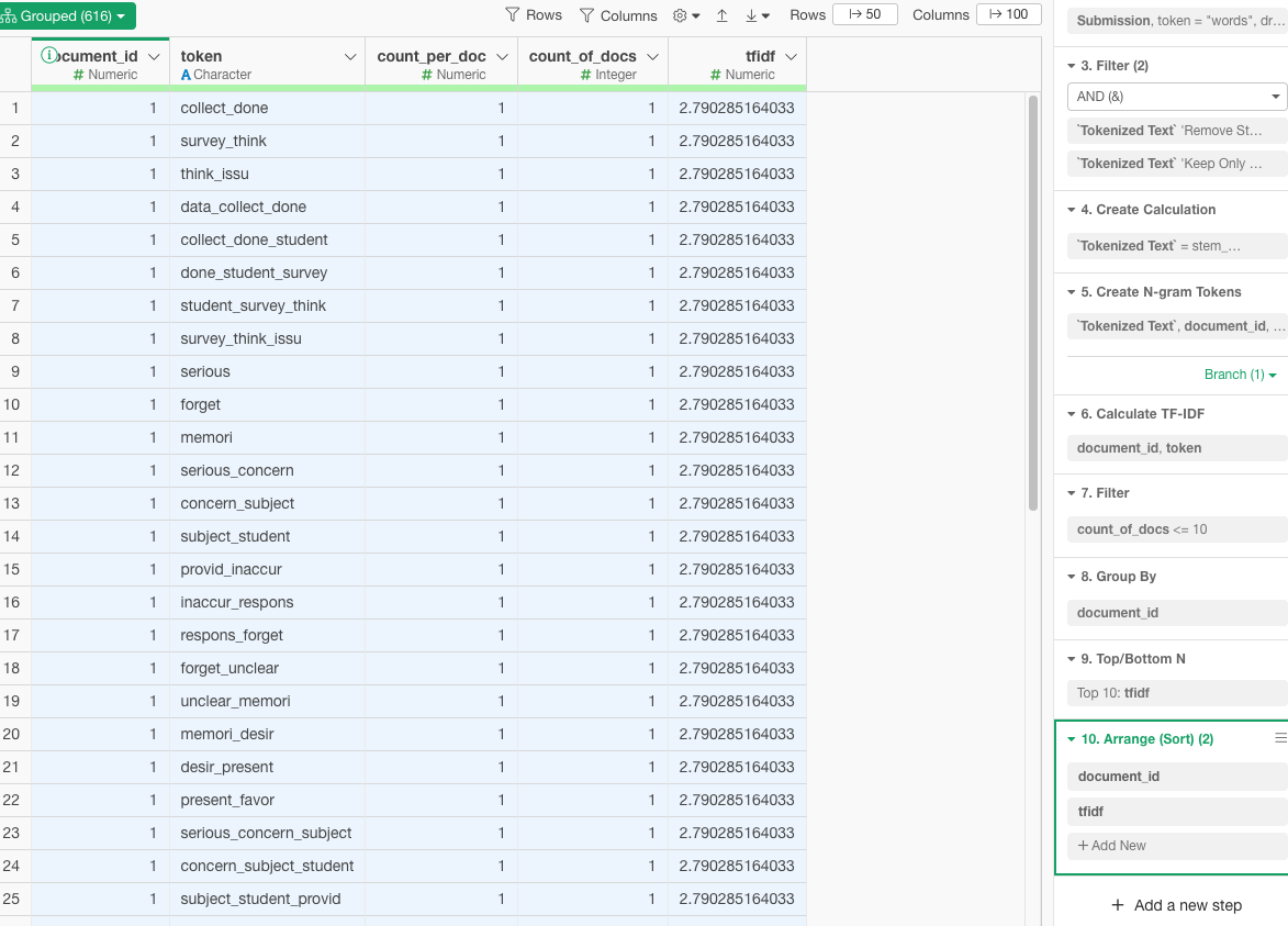
6. Important words for papers and authors
6.vi.Are the most relevant words, used in the comments, relevant for each one of the papers? Why?
Contextual Significance: The tokens are likely specific to the themes or topics covered in each paper. For instance, terms like collect_done and survey_think suggest topics related to data collection and survey methodologies, which would be relevant if the paper discusses these areas.
Specificity and Uniqueness: The TF-IDF metric ensures that the words are not only frequent within a particular paper but also relatively rare across other papers. This uniqueness enhances the relevance of these tokens to their respective papers, as they capture key concepts or discussions unique to each.
Inferential Analysis: Without the actual content of the papers, a precise validation of relevance is challenging. However, the TF-IDF approach typically identifies terms that are critically tied to the main arguments or content of the papers. For example, terms forming n-grams like data_collect_done or survey_type_interact are likely central to the discussions within those papers, indicating methodological discussions or specific case studies.
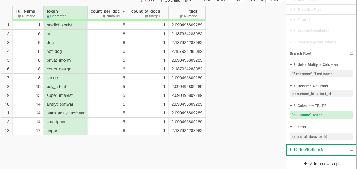
6.iv.1 Can you recognize the most important words that you have used?
the most i used is cours_design
6.iv.2 What is the most common word that you have used, that is least used by the rest of your classmates? Does it make sense to you?
no,yes it make sense to me
8.Sentiment Analysi
8.b.i. Which paper receive the most positive / negative comments?
Most Positive Comments: The paper titled "Srinivasa 2021" seems to receive the most positive comments overall, as indicated by the significant proportion of green bars (high positive sentiment).
Most Negative Comments: The paper titled "Benoit 2019" appears to have received the most negative comments, as it shows the most extensive part of the bar in red, indicating negative sentiments.
8.b.ii. Which student in average was the most positive / negative according to the analysis?
Most Positive Student: "Jewelina, Wen" (hhhh that is me !) exhibits predominantly positive sentiments across her comments, as evidenced by the long green bar in her section.
Most Negative Student: "Christina, Rodriguez" shows a considerable portion of red in her sentiment bar, suggesting she has the most negative sentiment on average.
8.b.iii. Do you think the sentiment analysis is accurate? Why?
Reliability and Limitations: Sentiment analysis algorithms, like the one presumably used to generate these charts, typically rely on the polarity of words to determine sentiment. This method can be effective in general contexts but may not always capture the nuances of sentiment accurately, especially in academic or technical discussions where the connotation of words might differ from common usage.
Context and Subjectivity: The accuracy of automated sentiment analysis can be limited by the context and subjectivity of language. For instance, technical discussions might use words that have neutral connotations in general language but carry positive or negative sentiments within the specific academic context.
Cultural and Situational Factors: Sentiment analysis may not account for cultural differences in expression or the situational context that might affect the interpretation of sentiments.