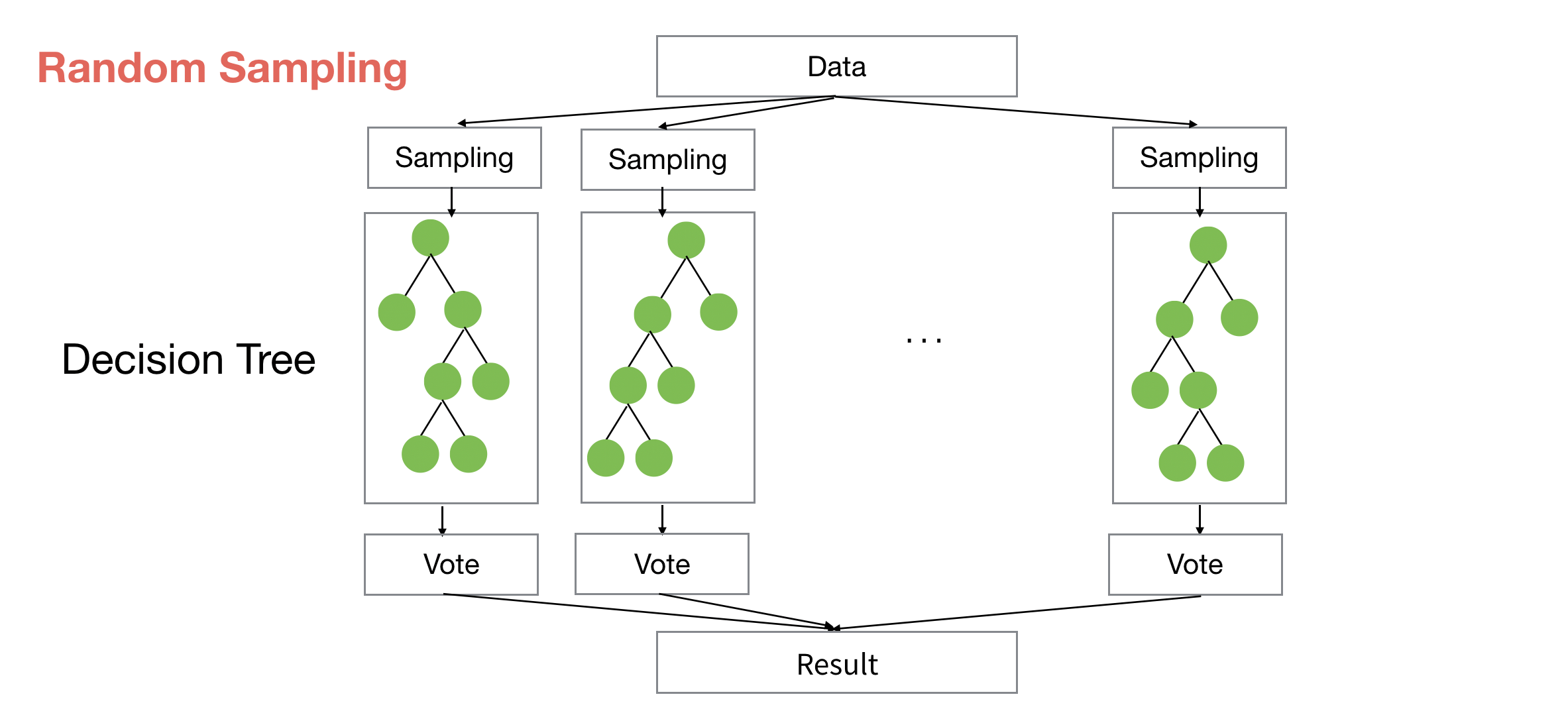
Finding Variable Importance with Random Forest & Boruta
There are two problems in order to interpret the result of Random Forest’s ‘Variable Importance’.
First, the result can vary every time you run it due to the ‘randomness’ of sample data used to build the model.
Second, you don’t know which variables are actually meaningful and which are not for predicting the outcome.
There is a method called Boruta, which helps to address these two problems.
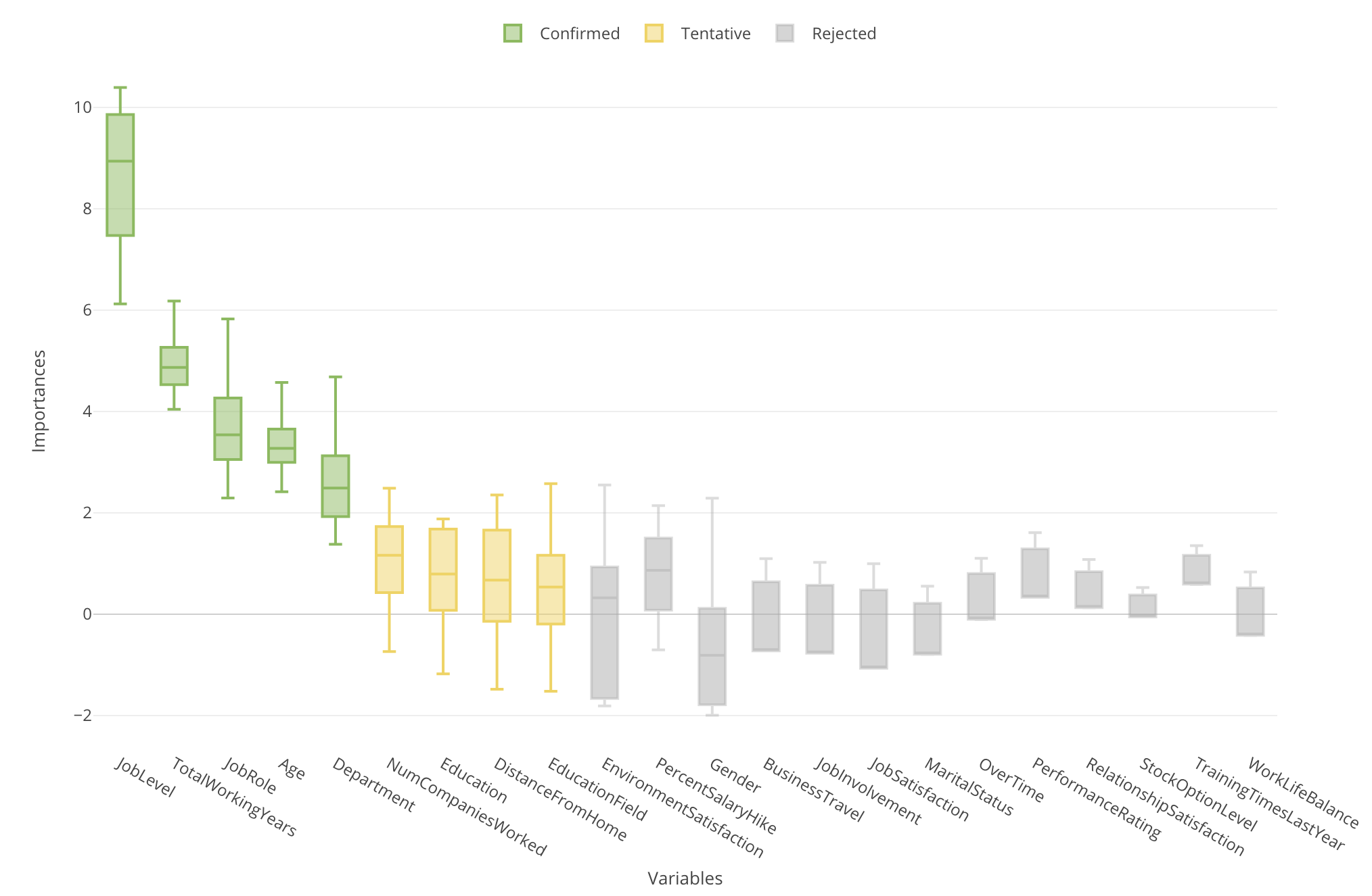
Boruta runs the Random Forest model building many times (the default is 20) and therefore you can see the importance scores as distribution with Boxplot, not as a single value with Bar chart.
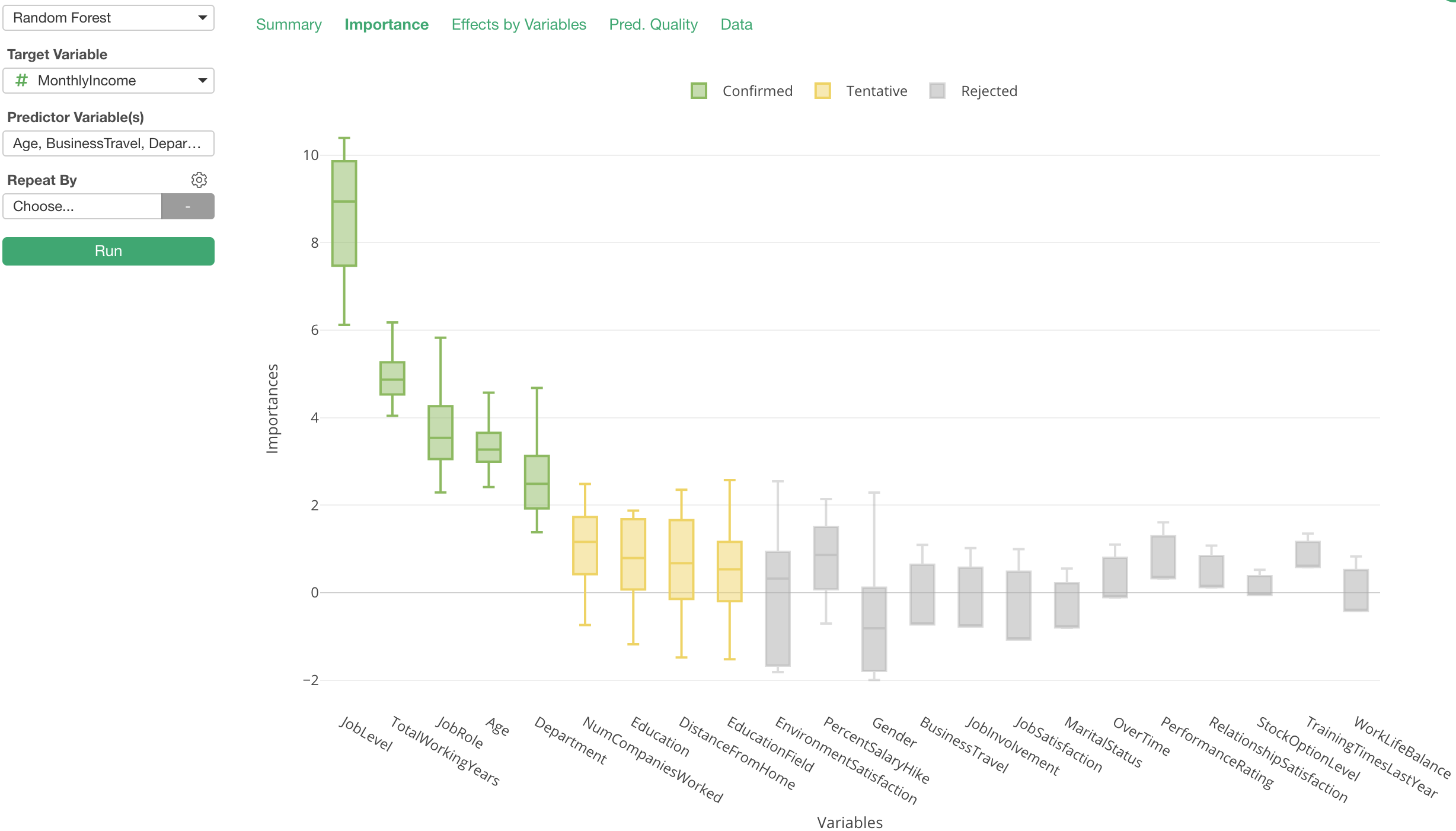
In Exploratory, when you run Random Forest under Analytics view you can access this chart simply by clicking on ‘Importance’ tab.
Statistical Test with Variable Importance Scores
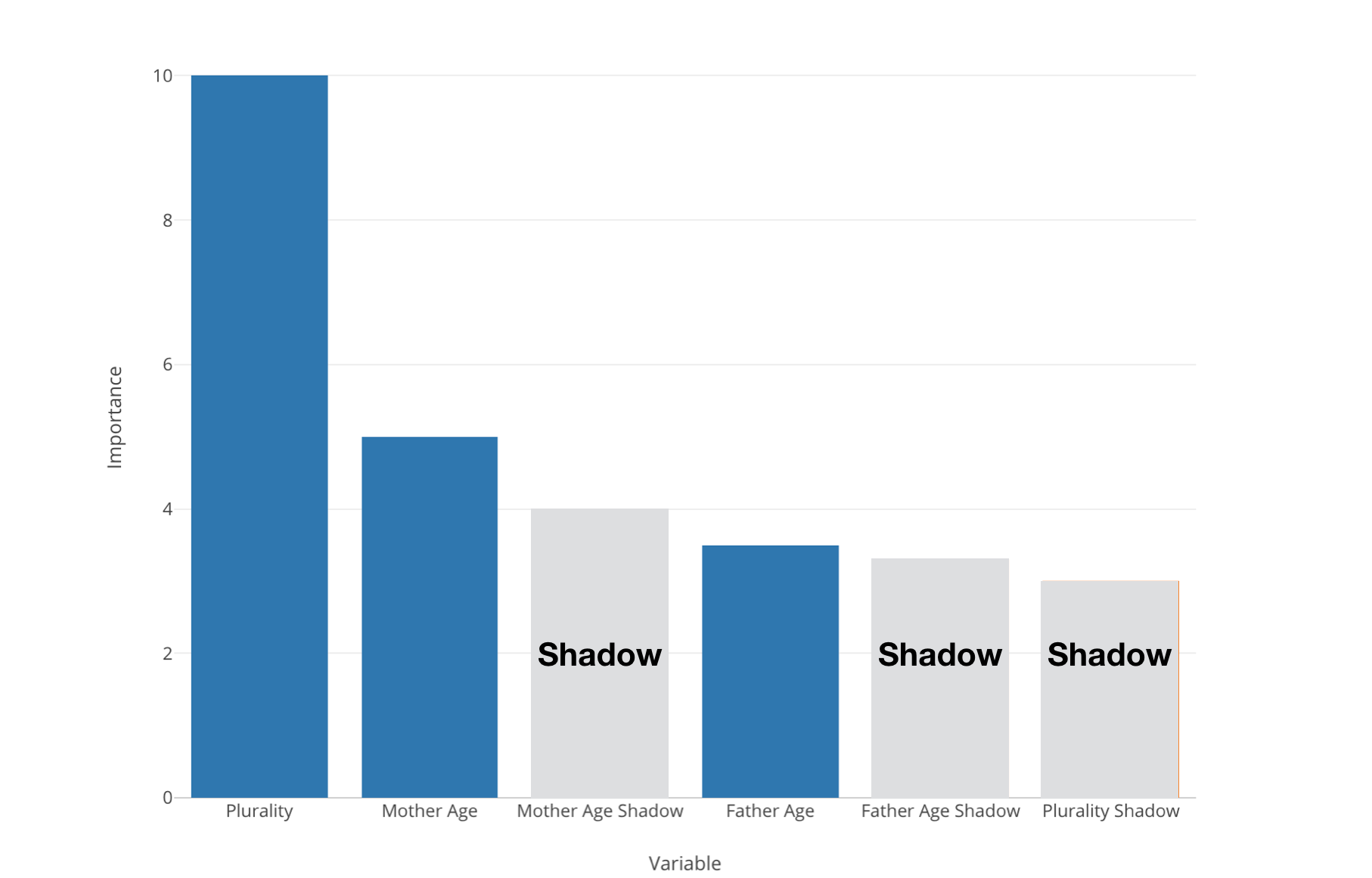
And while it runs 20 times or so, it also generates random variables called ‘Shadow variables’.
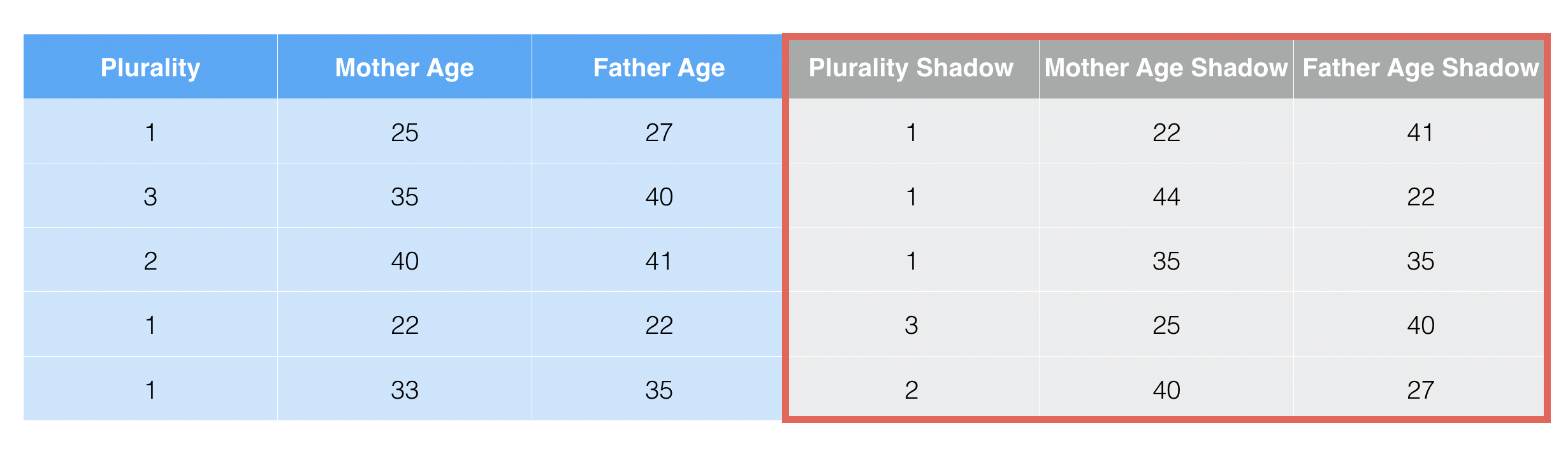
They are based on the existing variables but the values are randomly shuffled, which means that these ’Shadow variables should not have any correlation to the target variable.
Now when we run the variable importance with Random Forest some variables might be better than the ‘Shadow’ variables but some might not be.
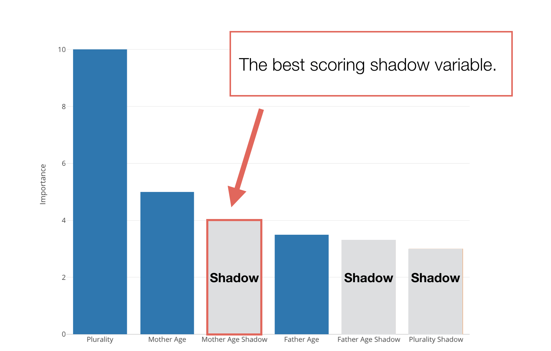
We want to pick the best ‘Shadow’ variable and see if a given predictor variable is better than this ‘Best Shadow’ variable or not.
And if it’s good then we count it as ‘Hit’, otherwise, count it as ‘Not Hit’.
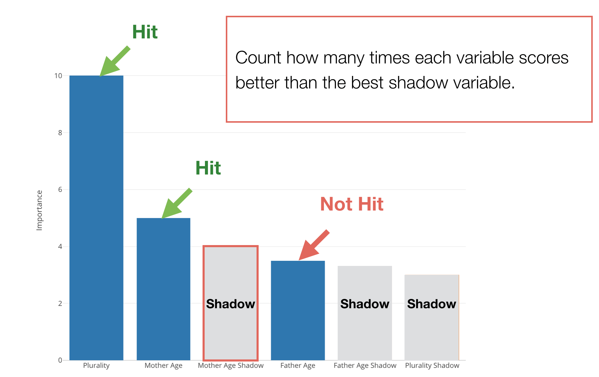
And it repeats for 20 times or so.
With this 20 ‘sample’ results, it does a hypothesis test (binomial test) to see if it is statistically significant to conclude that a given predictor variable is useful (or better than the useless ‘Shadow’ variables.)
Hypothesis Test
Here are the null hypothesis and alternative hypothesis for this testing.
- Null Hypothesis: There is no difference between a given variable and the best shadow variable in terms of the variable importance.
- Alternative Hypothesis 1: A given variable is better than the best shadow. (Useful)
- Alternative Hypothesis 2: A given variable is worse then the best shadow variable. (Not Useful)
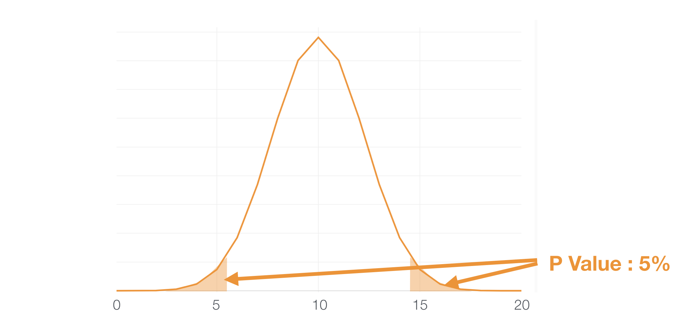
Under the assumption of the Null Hypothesis, the distribution of the number of Hits for the 20 experiments would look like this.
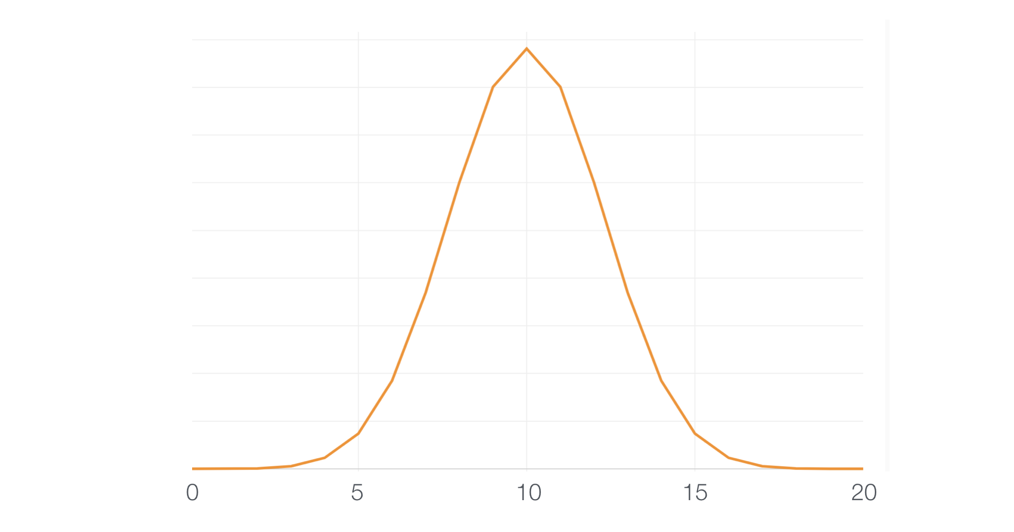
And if we take 5% (0.05) as a threshold of significance any value falls under the areas at both sides can be considered as ‘significant.’
Useful Variables
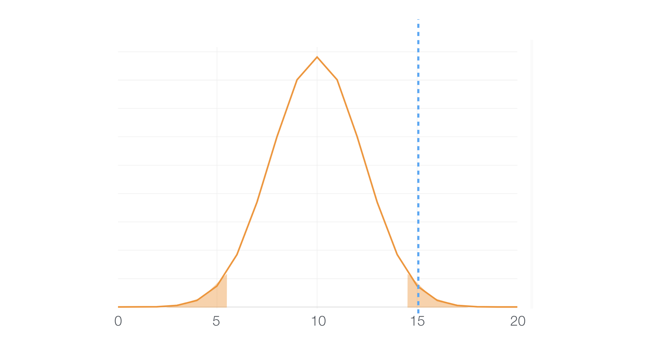
So, if a given predictor variable scores ‘Hit’ for 15 times out of 20 it falls under the 5% area, which means this can happen only with 5% of a chance. Since that’s a very rare event we can assume that the null hypothesis is not working, hence we can conclude that this variable is useful.
Useless Variables
And of course, there is an opposite side of the story. Some predictor variables might be scoring pretty low and those will end up falling down at the left hand side 5% area.
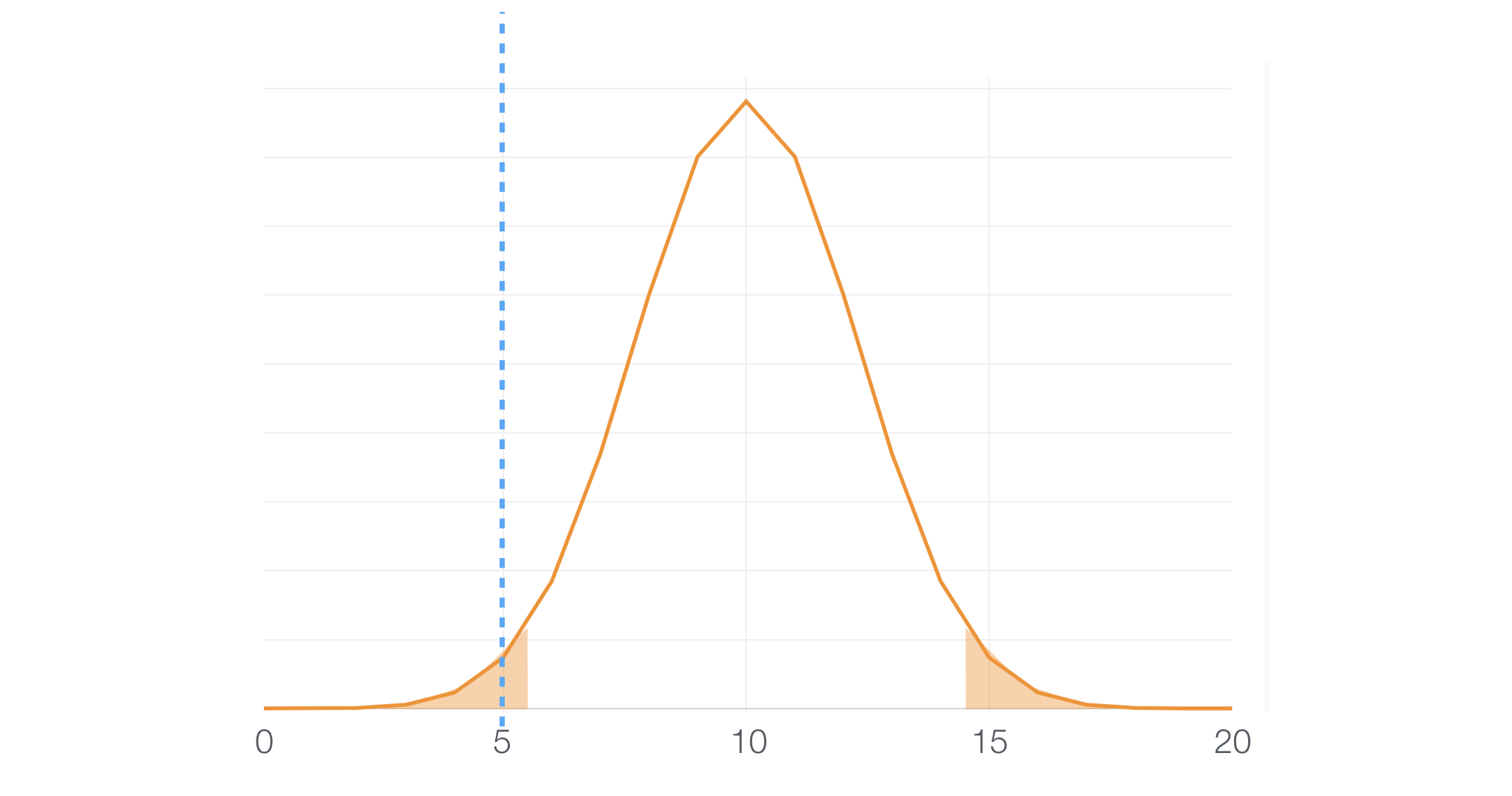
Hence, we can assume that the null hypothesis is not working for this case either, and we can conclude that this variable is NOT useful.
Tricky Middle
The tricky thing is that there are variables that fall into the middle.
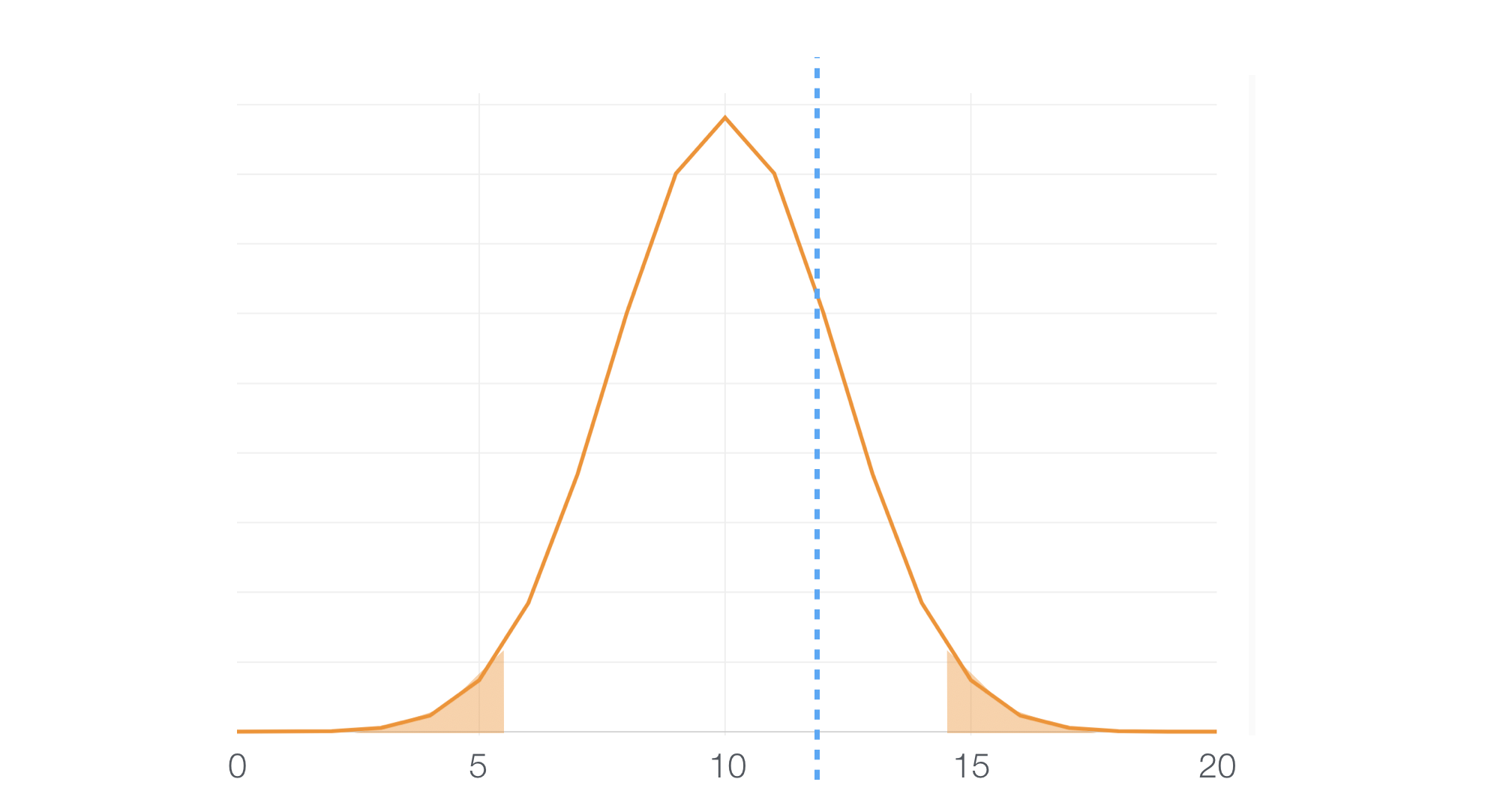
And this means that we can’t conclude either way, useful or useless.
If you know the nature of the hypothesis test you can increase the number of the sample size to improve the power of the test. But I’ll leave that for another post.
What Colors Are Telling US?
Now we know how Boruta does internally, let’s get back to the variable importance chart again.
The green color indicates that these variables are statistically confirmed that they are better than the ‘Shadow’ variables hence they are useful to predict the target variable.
On the other hand, the gray color indicates that these variables are statistically confirmed that they are worse than the ‘Shadow’ variables thence they are useless to predict the target variable.
Now, here is yellow. These variables mean that they are better than ‘Shadow’ variables sometimes but worse sometimes, and the test can’t conclude either way.
To conclude, you want to pay attention to the green-colored variables first, but also want to care about the yellow-colored ones because they might not have a significant relationship with the target variable but might have some relationship.